For a general overview of control charts, visit the Help me choose! page.
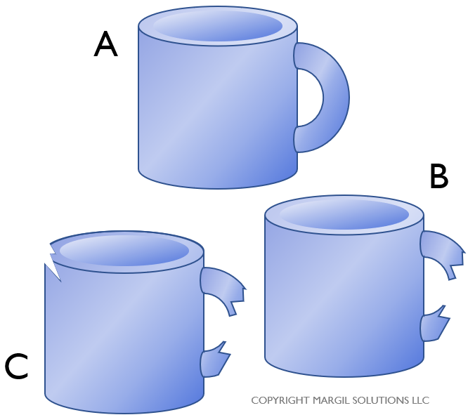
U charts allow you to track defects per unit (DPU). As a reminder, if you have three mugs. One mug (A) is free of any defects. However, one of the mugs (B) has a broken handle, and another mug (C) has a broken handle and a chip in the rim. In this case, we can say the following:
- There are 2 defective mugs.
- There are 3 total defects.
- There is 1 defect per unit.
 When collecting data for a u Chart, you will need record both how many samples you inspected (in the mug example, we inspected three mugs), and how many total defects you found in that sample.
Let’s look at an example. Suppose a company’s Finance department wants to track the average number of mistakes per expense report. To get started, create a u Chart data entry template. To do that they click “Control Charts” on the SuperEasyStats menu, and select “u Chart” from the list of options.
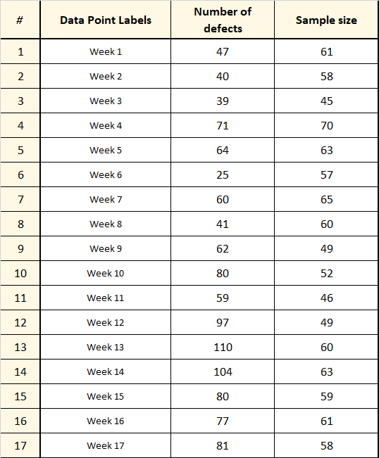
Over the course of 17 weeks they capture the total number of expense forms submitted (the sample size) and the total number of defects they found (each form can have more than one defect). They enter that data into the template as shown at right (note that the Data Point Labels are optional, but helpful for keeping track of your data).
To convert this data into a control chart, just click “Control Charts” again on the SuperEasyStats menu. You will be prompted about whether you want to analyze the data on this template, or create a new template. Click “Analyze current data sheet”.
The chart generated from this data is shown below. The horizontal axis shows each week, and the vertical axis shows the defects per unit (i.e. mistakes per expense report) for that week. You may notice that the upper and lower control limits are not straight. This is because the control limits for u Charts are a function of the sample size. If the sample size changes from data point to data point, the control limits will also change:
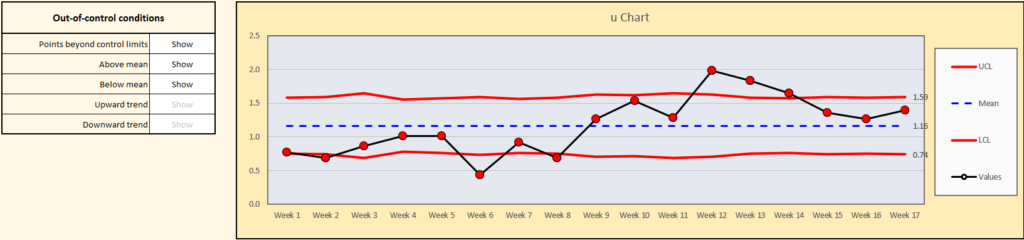
In this chart, all the points are highlighted in red, which means they represent out-of-control conditions. To the left of the chart is a menu that lets you show or hide the various out-of-control conditions that are highlighted on the chart (any out-of-control conditions that are grayed out are not applicable on this chart).
Clearly something strange is going on here. In this case the manager of the Expense group realized that a new form had been introduced on Week 9, which represented a change to the process. She decided to split the chart at week 9 and evaluate weeks 1 – 8 independently from weeks 9 – 17. That can be easily done by entering the letter ‘s’ on the data table next to the chart. For good measure, the manager also updated the label for data point 9.
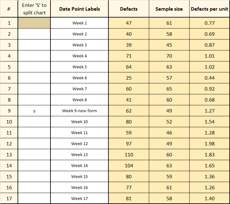
Immediately the chart will update to look like this:
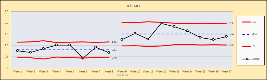
Now it seems clear that the number of defects per unit (DPU) has taken a jump starting on week 9 when the new expense form was introduced. This is obviously the opposite of what the Finance department was hoping for, so they’ll need to reconsider how the form is laid out and determine what is causing all the errors.
An interesting thing to notice is that on week 6, there was a point below the lower control limit, which means that there was a statistically lower number of defects that week. They Expense team manager may want to investigate to find out why that was.