I-MR control charts are best used when you have variable (measured) data, but it’s inconvenient or impossible to “subgroup” your data (as described in Control Charts – Help me choose!). When creating an I-MR chart, it’s important to understand if the data your plotting follows the Normal distribution. You can use the SuperEasyStats “Normality Test” function to determine if you can treat your data as normally distributed.
In the following example, the Finance department of a small consulting firm wants to determine if the time required to conduct the monthly close-out is in control. Because they can only get one data point per month, they chose to plot individual values rather than subgroup their data.
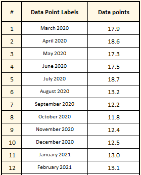
To start, they created a template for their data by selecting the “Control Charts” button in the SuperEasyStats Ribbon and then choosing “Individuals with Moving Range (I-MR) Chart”. That creates an I-MR Data Template where they pasted in the previous 12 months of data, as shown here. Note that the data represents the number of hours required for the Finance department to complete their standard work to close the books at the end of each month.
As mentioned above, they decide to check if this data is normally distributed using the “Normality Test” function. That function tells them that this data is very unlikely to be be normal. They can still use the I-MR chart, but will have to make one minor adjustment, which we will discuss below.
Now that they have the data entered into the template, they can easily create the I-MR chart by clicking the “Control Charts” button again. They will be asked if they want to create a Control Chart using the data on this page. To create the I-MR chart, simply click “Yes”.
Assessing the I – MR Charts
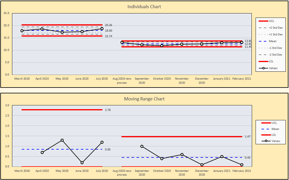
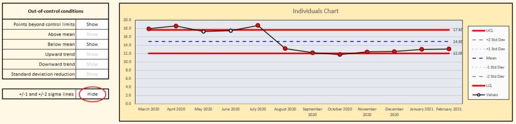
SuperEasyStats will create two charts. The top chart shows the individual data point for each month along with calculated control limits for the values. Because the data on the chart is not normally distributed, the Finance team selected “Hide” next to “+/-1 and +/-2 sigma lines”.
The bottom chart shows the range between each successive point, with calculated control limits for the range.
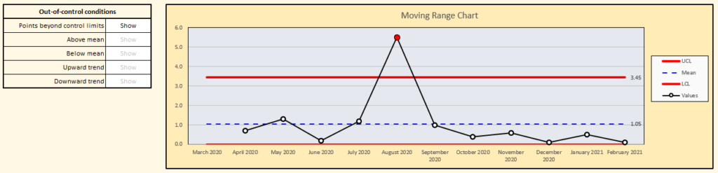
The first thing we notice are several out-of-control conditions. In the Individuals chart, we see that the first several points have much higher values than the points that follow. There is also an out-of-control point on the Range chart at the point where the higher values shift to the lower values (August 2020).
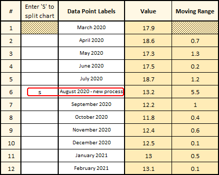 It certainly seems as though something about the process changed in August 2020. It turns out that a member of the Finance team had taken a Green Belt class and had used what they learned to reduce the time required to perform the month-end close out.
In a situation like this, it makes sense to split the chart at the point where the process changed. This can be easily done by editing the data table as shown – simply enter the letter ‘s’ on the row where the new process started, and (optionally) edit the label for the data point as well. The two charts will immediately update as shown below (note, you can enter as many splits in the chart as you like).
By splitting the charts, the Finance department can now detect if the new process is in or out of control, without the old, pre-process-improvement data influencing their analysis. It certainly looks as if the new process is in control and taking less time than it did before the improvement project. As they add more data month over month, they can update the I-MR Data Template and recreate the chart to see how the process is performing.