Scatter plots can help you determine if one variable has an effect on another. The variable you are controlling is often referred to as the independent variable (or the input variable). The variable that may be affected by the independent variable is called the dependent variable (or the output variable). To see how this works, let’s use an example.
A car company is working on a new electric car model. They want to understand how temperature affects the range of a fully charged car battery. To do that, they charge the car at various temperatures, and then drive it under similar conditions to see how far it will go. The temperature (which they are controlling in this experiment) is the independent / input variable, and the car’s range is the dependent / output variable.
 To do this analysis in SuperEasyStats, first click the Scatter Plot and Regression button on the SuperEasyStats ribbon. A data entry template will be created, into which you can type your data. The input variable data should go into the left-hand column, and the corresponding output data should be entered into the right-hand column. The car company’s data is shown here.
Notice that they have tested the car at 6 different temperatures ranging from 0° to 100° Fahrenheit. At each temperature, they recorded how far the car could travel on a full charge. For example, you can see that when the battery was changed and the car was driven at 60°, it had a range of 247 miles.
Now they want to analyze the data and see how strong the correlation is between temperature and range. Once the data is entered, click the Scatter Plot and Regression button again. You will be asked if you want to analyze the data on this sheet or create a new data sheet. Choose to analyze this data sheet. SuperEasyStats will generate a scatter plot from the data, along with additional information.
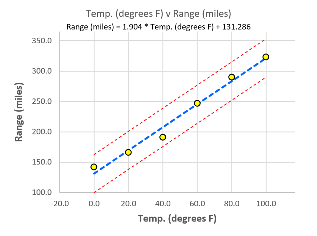
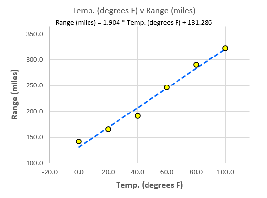 The first thing you may notice is the scatter plot itself. The independent variable data (temperature) runs along the x-axis (on the bottom) and the dependent variable data (range) runs along the y-axis (on the left). Each yellow dot on the graph circle represents a data point from the table above. You can see that the point at 60° on the temperature axis is just about at 250 miles (actually 247) on the range axis.
The dotted blue line represents the best straight line that can be drawn through the data points that minimizes the distances between the actual values (the points on the graph) and the line itself. The equation above the graph is the equation that describes the line and is mathematical model of the behavior of this system and is sometimes called the prediction line or the regression line (hence the term “linear regression”).
SuperEasyStats also provides information to tell you how strong the model is:

The Basic Statistics provided are:
- Count(n): the number of data points.
- Standard error: The average “error” around the prediction line. Essentially, this is the average distance the data points are from the line (which represents the predicted values). In general, 95% of all points should fall within 2 standard error of the line, and 99% should fall within 3 standard error.
- Correlation (R): “R” is an indicator of how well the output correlates with the input. R can have a value from -1 to 1.
-
- A value close to +1 indicates a strong positive correlation – as the input variable goes up, the output variable goes up.
- A value close to -1 indicates a strong negative correlation – as the input variable goes up, the output variable goes down.
-
- Model strength (R2): “R-squared” is a measure of the predictive strength of the regression model. R-squared can have a value from 0 to 1. The closer R-squared gets to 1, the better the model is at predicting.
In this case, we can see that there is a very strong positive correlation (0.99). The strength of the model (0.983) is also very strong. That means that within the range of experimentation (0° to 100° F), this model can explain over 98% of the variability that we see in the distribution of the points.
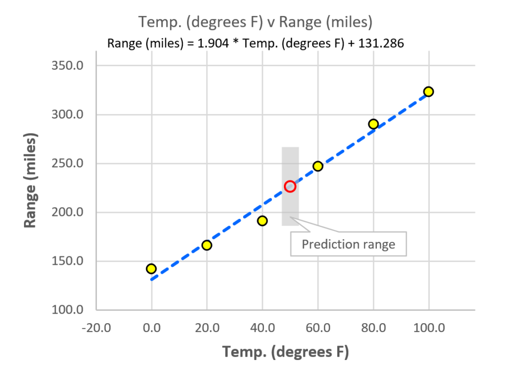
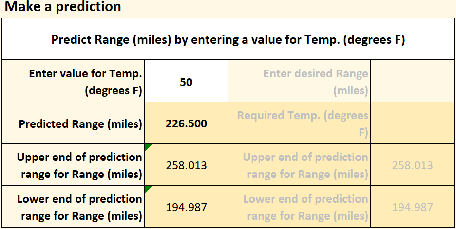
We can use this knowledge to make predictions using the “Make a prediction” function. The experiment didn’t measure the car’s range at 50° F, but the model allows us to make a very good estimate of what the range will be. Where you see the “Choose a prediction option” cell, click the dropdown menu and select “Predict Range (miles) by entering a value for Temp. (degrees F)”, as shown here.
The model predicts that at 50° F the car will have a range of 226.5 miles. Of course, there is some error associated with the model (the standard error, from above), so we probably won’t get exactly 226.5, but the standard error allows us to predict the range in which the actual mileage will fall. You can see that range as a gray vertical bar above and below the predicted range on the chart.
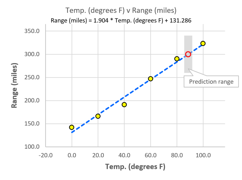
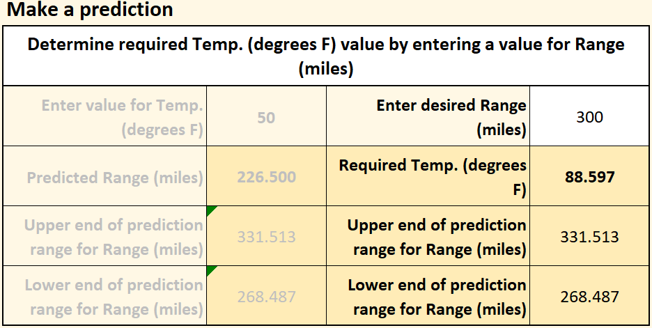
You can also start with an output that you want (a certain range) and find out what input you will need to achieve that range. Under “Make a prediction”, select “Determine required Temp. (degrees F) value by entering a value for Range (miles)”. If you enter a range of 300 miles, the model tells you that the temperature will need to be 88.597° F. The chart shows the prediction, along with the standard error for what the range will be if you actually drive the car at that temperature. Of course, the car company will eventually want to verify these predictions with actual experiments or tests, but the ability to make such predictions can be extremely valuable.
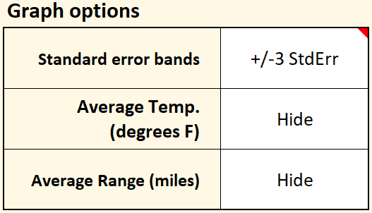
SuperEasyStats allows you to easily see the standard error range across the whole graph by adjusting the “Graph Options”. If you select “+/- 3 StdErr” in the “Standard Error bands” dropdown menu, the graph will update as shown below. You can also have the graph display the average input and output values if you like by changing those graph options.
An important point to keep in mind is that the model is only valid for the range of values used to create it, and the actual behavior of your system or process may be very different beyond that range. Using the model to predict points beyond where you experimented is known as extrapolation and any such predictions should be confirmed with an experiment.
Below the prediction area of the sheet are some key statistics for the prediction equation itself, which, as shown above, is:
Range (miles) = 1.904 * Temp. (degrees F) + 131.286
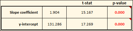
This is in the form of the standard equation for any line: y = mx + b, where m is the slope of the line, and b is the y-intercept. The “slope coefficient” for our equation (m) is 1.904. As shown in this table, the calculated p-value is so small that it rounds to 0.000. What is the p-value? In this case, it’s essentially the percentage chance that the slop of the line is statistically equal to zero. If the p-value is very low (typically below 0.05, or 5%), we conclude that the slope is not zero, and that there is some relationship between the input and the output.
There is also a p-value for the y-intercept (b) of the line (131.286). This shows us where the line will intercept the y-axis if the input value (x) is zero. In this case, the p-value is telling us the percentage chance that the y-intercept is statistically equal to zero. Because the p-value is so low, we can safely conclude that the y-intercept is not, in fact, zero.
In this example it might seem obvious that the y-intercept is not zero because we actually measured the Range (the output) when the input (Temp) was zero. But in other cases things may not be so straightforward, so having statistical tests is useful to verify the significance of the terms in the equation.