For a general overview of control charts, visit the Help me choose! page.
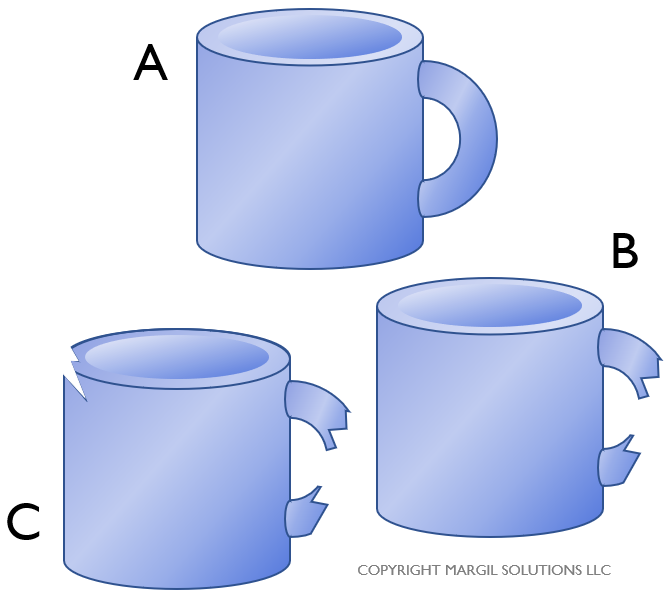
C charts allow you to track defects. As a reminder, if you have three mugs. One mug (A) is free of any defects. However, one of the mugs (B) has a broken handle, and another mug (C) has a broken handle and a chip in the rim. In this case, we can say the following:
- There are 2 defective mugs.
- There are 3 total defects.
- There is 1 defect per unit.
When collecting data for a c Chart, you will simply be counting defects. Let’s look at an example of a manufacturer of ceramic mugs with handles (similar to those shown here). The manufacturer runs a single shift, and wants to track the number of defects they are creating in their production process. They decide that every day they will randomly select a defined number of mugs from that day’s production run and count the total number of defects in that sample. Note that for a c Chart, the sample size should remain constant–so if they decide the sample size is 100 mugs, then it should be 100 mugs each day.
 Note that a mug can have more than one defect (for example, a mug might have a chip, a scratch, and the color might be incorrect). To record their data, they create a data entry template by clicking “Control Charts” on the SuperEasyStats menu and selecting “c Chart” from the list of options.
Over the course of 12 weeks they capture the number of defects found in each daily sample of 100 mugs. They enter that data into the template as shown at right (note that the Data Point Labels are optional, but helpful for keeping track of your data).
To convert this data into a control chart, just click “Control Charts” again on the SuperEasyStats menu. You will be prompted about whether you want to analyze the data on this template, or create a new template. Click “Analyze current data sheet”.
The control chart generated from this data is shown below. The average number of defects over this time is represented by the dotted blue line and is 11.83. The calculated upper and lower control limits are also shown. On Day 7, the number of defects is above the upper control limit. That point it is a statistical outlier and should be investigated to find out what caused that spike in defects.
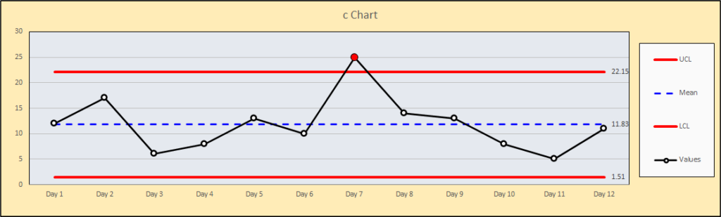
While control charts can’t tell you what happened to cause an out-of-control condition, they do provide a signal that something is going on in your process that needs further research. In this case, the if the cause of the spike can be identified, it should be eliminated so it doesn’t recur.