Box plots are a good, visual way to see the spread of a single continuous data set, or to compare the spread and relative locations of multiple continuous data sets. Box plots break down data sets into “quartiles” so that you can easily see how your data is concentrated or spread out. The diagram below details how a box plot visually summarizes a set of data:
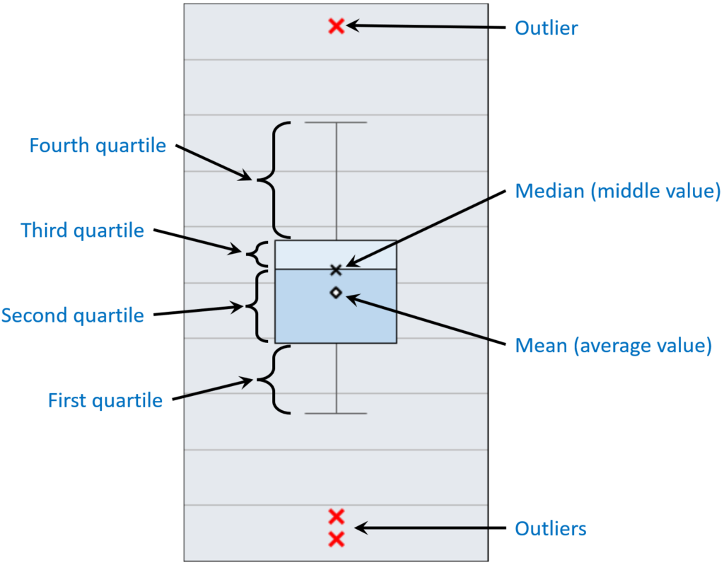
Each quartile contains the 25% of the data. The first and second quartiles combined contain the bottom 50% of the data, and the third and fourth quartiles contain the upper 50% of the data. The median represents the middle value (half the values are lower and half the values are higher), and the mean represents the average value of all the data.
Notice also that outliers (if any) are shown. Outliers are defined by the “inter-quartile range”, or IQR. The IQR is the range from the top of the third quartile to the bottom of the second quartile. Any data point that lies more than 1.5 times the IQR above the top of the third quartile, or more than 1.5 times the IQR below the second quartile is considered an outlier.
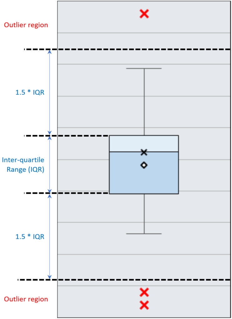
Let’s look at an example of how you could use a box plot to compare some datasets:
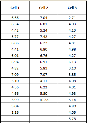
A company has three production cells that produce the same sub-assembly. They want to understand the differences in assembly times between the cells. They start by creating a Box Plot Data Template in SuperEasyStats by clicking the Box Plot button on the SuperEasyStats ribbon. Because there are three production cells, they choose to have three columns in the template. Then they gather data by timing the assembly operation at each cell multiple times over the course of several days and entering the data into the template.The data is shown below. Each entry represents the number of minutes to produce a single sub-assembly:
To create the actual box plot after the data is entered, they click the Box Plot button again on the SuperEasyStats ribbon. The initial box plot is shown below:
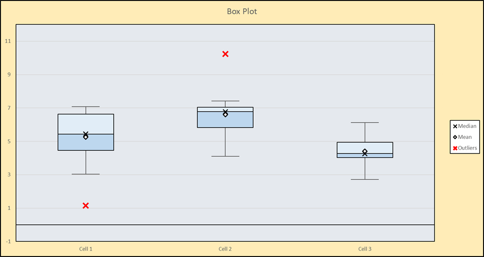
This box plot is pretty good, but notice that the scale of the y-axis includes negative values. Since this is a time-based measurement, negative numbers are impossible. To adjust the scale of the y-axis, click the Box Plot button on the SuperEasyStats ribbon again. You’ll see the following dialog box:
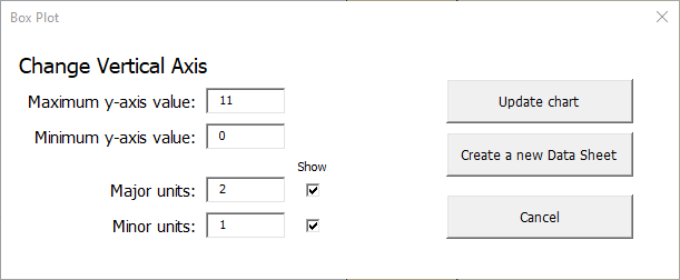
Here we have changed the maximum value of the y-axis to 11 and the minimum value to 0 (since negative numbers do not apply). Notice also that the major units have been changed to 2, and the minor units have been changed to 1. The “Show” checkbox has been clicked for both minor and major units. Clicking “Update Chart” produces the result below:
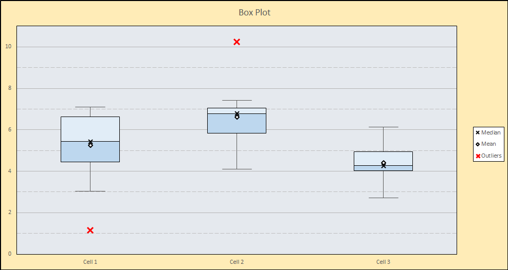
The major units are indicated by numbers on the y-axis, and shown as solid grid lines while the minor units are shown as dashed grid lines.
Comparing the production cells, we can see that Cell 3 has the lowest average time, however Cell 1 recorded the lowest single assembly time–just over 1 minute–shown as the red outlier near the bottom of the chart. It would be worth investigating how they were able to build that sub-assembly so quickly! Cell 2 not only has the highest average time, but they also had one sub-assembly that took an abnormally long time (over 10 minutes), which would also be worth investigating. Based on this analysis, Cell 3 not only has the lowest average, but they do seem to be the most consistent (no outliers). Also notice that 75% (the bottom three quartiles) of their assembly times are below 5 minutes. Determining how they are able to produce faster and more consistently than the other cells would be a good place to start in improving the overall operation.
