p Control charts can be used when you are tracking the proportion of defective units in a process, but the sample you are testing can vary in size. For example, a Finance department is interested in the proportion of expense reports that are defective each week, however the number of reports submitted each week changes.
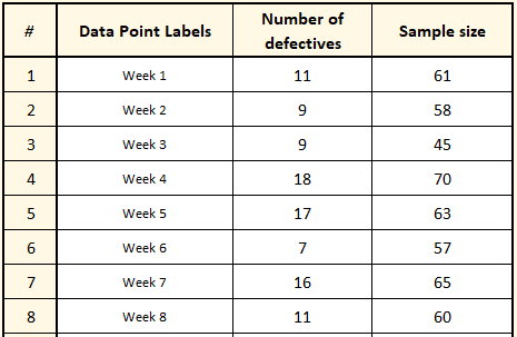
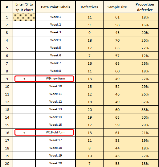
They want to create a control chart, so first select “Control Charts” from the SuperEasyStats menu, then chooses “p Chart”. That creates a data entry template. They start by entering the number of defective forms and the total number of forms submitted each week, as shown at left. They also enter the name of the week in the “Data Point Labels” column (this is optional).
Once they’re ready to create the chart, they click the “Control Charts” button again. They will be asked if they want to create a Control Chart using the data on this spreadsheet To create the p Chart, simply click “Yes”.
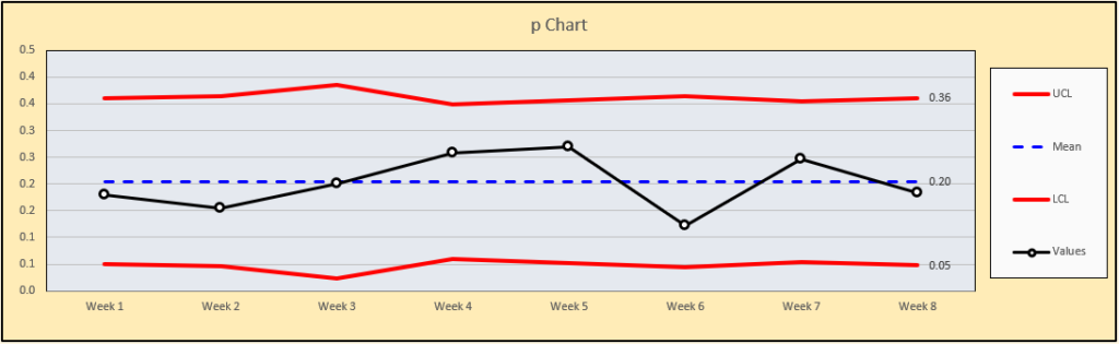
The chart is created as shown below. They see that while there’s variation week-to-week, on average about 20% of forms had errors and were therefore considered “defective”.
After 8 weeks of collecting data they decide to change the layout of the expense report form to see if they can reduce the number of defective forms submitted each week. They continue to add data to the same data entry template and after several more weeks, they generate a new p Chart by clicking “Control Charts” again. The new chart is shown here:
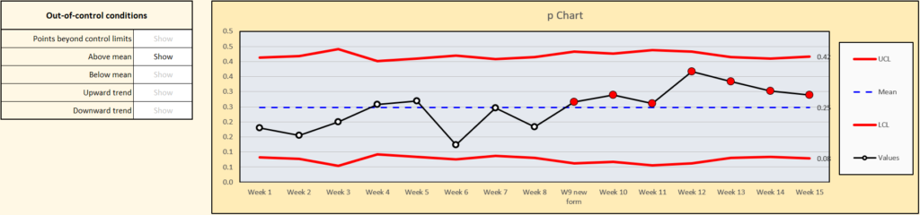
Unfortunately it appears that the new expense form is having the opposite effect and causing a higher proportion of defective expense reports. The Finance department initially thought errors would go down once people got used to the new form, but after several weeks and repeated training sessions, the proportion of defective expense reports stayed high. The seven consecutive points above the average indicate an out-of-control condition.
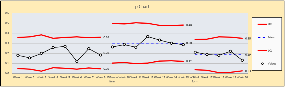
Finally, after week 15 they decided to stop using the new form and return to the old form. They continued to collect data and added it to the same data entry template. Five weeks later the control chart looked like this:
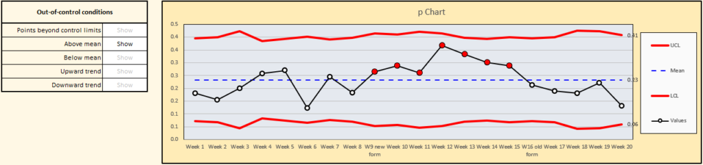
The proportion of defectives seems to be going down. The Finance department decided to split the chart in two places to separate the weeks with the new form from the weeks with the old form. They were able to do this easily by editing the table next to the chart. They added an ‘s’ next to Week 9 and another ‘s’ next to week 16, as shown below:
The chart immediately updates as shown. After returning to the old form the proportion of errors seems to have returned to the old rate. The Finance department decided to use the lessons-learned to redesign the form once again. They’re still working on the new design, taking into account customer feedback.