Typically, np Control charts are used when a process is measured by counting how many defective units it produces per some standard amount of units. For example, a semiconductor company may use and np Chart to track how many chips in each lot of 100 are defective. Because the subgroups size (100) is constant, we use an np Chart. If the subgroup size were to vary, we would use a p Chart instead.
 To set up the chart, the semiconductor company first selects “Control Charts” from the SuperEasyStats menu, then chooses “np Chart”. That creates a data entry template.
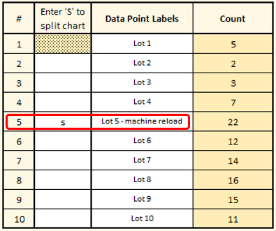
They enter the data as shown at left. Note that the sample size is entered as 100, because when they inspect the chips, they always take that amount from each lot and inspect them. For each lot they inspect, they enter the number of defective chips in the “count” column.
Once they’re ready to create the chart, they click the “Control Charts” button again. They will be asked if they want to create a Control Chart using the data on this spreadsheet To create the np Chart, simply click “Yes”.
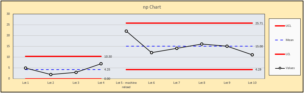
Assessing the np Chart
The chart is created on a new spreadsheet, as shown below. Notice immediately that there is one point that is beyond the upper control limit. The list of out-of-control conditions allows you to show or hide any such conditions that are detected in your chart (if a condition is not detected in your chart, the “Show” option will be grayed out). It also seems as if the number of defective units found in each lot after the that out-of-control point is higher than before.
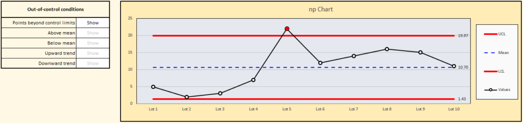
Out-of-control points are signal that something unexpected has affected the process, but you need to go investigate to find out what that was. In this case, the team leader spoke to the machine operator and discovered that just before Lot 5 was produced, the machine was reloaded with new silicon wafers from a different supplier. This is a clear change in conditions from what was happening before.
To see this more clearly, you can split the chart at the point where the change happened, and (optionally) change the data point label to add some helpful detail.
The chart will immediately update as shown. After seeing this, the team leader decides to pay close attention to the relationship between suppliers and quality.