X-Bar charts are designed for situations where you’re creating charts from variable (measured) data. When creating an X-Bar chart, each point on the chart doesn’t represent an individual value, rather each point is determined by taking multiple measurements and averaging them together. The group of points you average together is called a “subgroup”, and the number of points in the subgroup is the subgroup size. By subgrouping, X-Bar charts take advantage of the the Central Limit Theorem to insure that the data being plotted is normally distributed, which gives variable control charts much of their power to identify out-of-control conditions.
SuperEasyStats can easily create two kinds of X-Bar charts:
- X-Bar R – When the subgroup size is constant, and consists of between 2 and 9 values, use the X-Bar R option. SuperEasyStats will generate to charts – one is the chart of the average values (X-Bar) of the subgroups, along with calculated control limits, and the other is the range (hence the ‘R’) of each subgroup along with calculated control limits. The subgroup range is simply the difference between the largest and smallest values in the subgroup.
- X-Bar S – If the subgroup size varies, or it consists of between 10 and 25 values, use the X-Bar S option. This option also creates two charts. The first is the chart of the average values (X-Bar) along with calculated control limits, and the second chart shows the standard deviation (hence the ‘S’) of each subgroup along with calculated control limits.
Let’s look at the following example. A small parts supplier manufactures nuts and bolts for its customers. The inner diameter of the nuts must be 0.5 centimeters. The manufacturer wants to use an X-Bar R chart to insure that their manufacturing process is in control. The supplier runs a single 8 hour shift each day. They decide that two times per hour they will pull a sample of 6 nuts from the line to create their chart.
They start by creating an X-Bar data entry template in SuperEasyStats. To do that they click “Control Charts” on the SuperEasyStats menu, and select “X-Bar R or X-Bar S Chart (data in subgroups)” from the list of options.

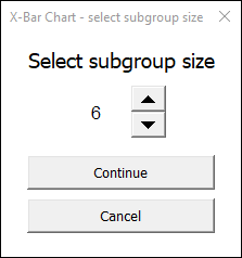
When prompted to select a subgroup size, they change to option to 6
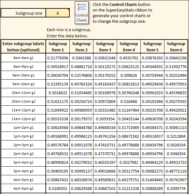
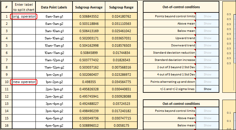
A blank data entry template is created. In the example below you can see that the company has filled it in with their data. They’ve labeled each row with the hour of the shift, and an abbreviation indicating the group of nuts for that hour (e.g., “8am-9am g1” is the first group of nuts measured that hour). The numerical values in each row are the measured inner diameters of the nuts in that sample.
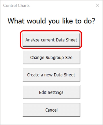
After a full 8-hour shift, 16 data rows have been filled in. The next step is to generate the control chart. They do this by clicking “Control Charts” on the SuperEasyStats menu, and selecting “Analyze current Data Sheet”:
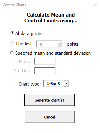
In the following dialog, they are asked what data they want to use to calculate the control limits for their chart. In this case, they choose to use all of the data they captured, and the select X-Bar R as the chart type:
As described above, for X-Bar R and X-Bar S charts SuperEasyStats will create two charts. Since we are creating an X-Bar R chart, the top chart will plot the averages of each row of data, and the bottom chart will plot the range of each row (the largest value in the row minus the smallest value in the row).
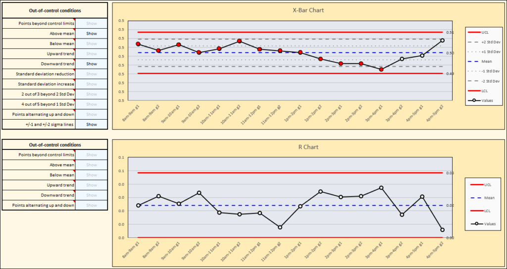
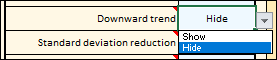
The first thing to notice is that the R-chart (on the bottom) appears to be in control, but there are two out-of-control conditions shown on the X-Bar chart (at the top). The out-of-control conditions are listed next to each chart. In this case, we can see that there is a run of points above the mean (by default, 9 or more consecutive points above or below the mean will be shown as out-of-control). There is also a downward trend highlighted (by default, 6 or more points all increasing or decreasing will be highlighted as an out-of-control trend). When the chart is first generated, all out-of-control conditions are highlighted, but you can turn them on and off individually to see them more clearly. For example, if you want to see the “Above mean” condition on its own, you can choose to hide the downward trend by clicking on the cell next to “Downward trend” that says “Show” and changing it to “Hide” as shown here:
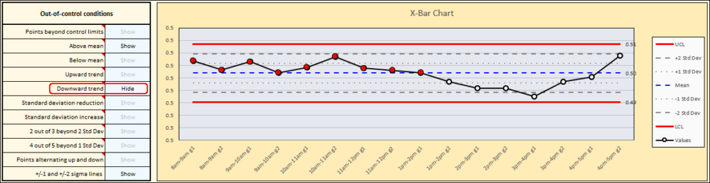
You’ll see the points representing the downward trend turning from red to white, and the chart will appear like this, highlighting only the run of points above the mean:
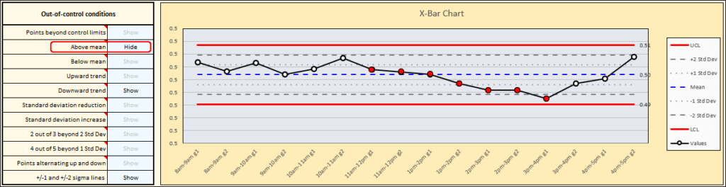
If you want to see the “Downward trend” condition on its own, you can turn the “Downward trend” back on, and turn off the “Above mean” condition. That generates the following chart, highlighting just the points that represent the downward trend:
Notice that some points are part of both of the out-of-control conditions!
In this case, the company found out that the initial shift operator had to leave after the “1pm-2pm g1” sample had been taken. A new operator took their place. It’s possible to split the chart to see the effect of the individual operators. First, make sure all out-of-control conditions are set to “Show”, then you can split the chart by adding labels to the data table to the left of the chart, as shown:
The result are the X-Bar and R charts as shown below. Notice that once you account for the fact the there was an operator change, the out-of-control conditions disappear. It appears that while the operators were consistent within their own work, they weren’t producing the same average result, which is why their averages are different from one another. It also seems as if the new operator has more variation, indicated by the wider control limits in their section of both the R chart and the X-Bar chart.
