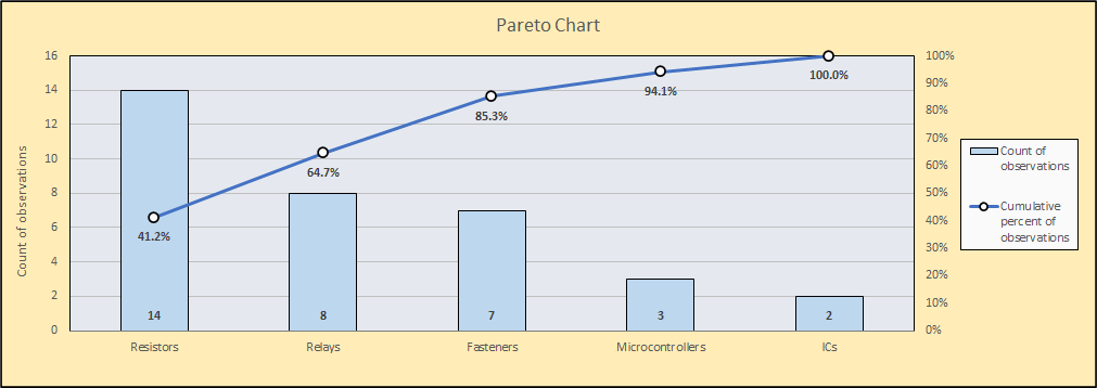
Pareto charts are powerful tool for understanding and visualizing problems that are affecting processes and for prioritizing problem solving efforts. To see how, let’s look at an example:
A manufacturer has noticed that a key step in a fabrication process is operating too slowly to meet customer demand. To understand what might be causing the slowdowns, they ask the operators who work in the step to make a note whenever an unanticipated interruption causes production to slow or stop. After a week of collecting data, they categorize those causes and enter them into the Pareto Chart Data Entry Template, which can be created by clicking the Pareto Chart button on the SuperEasyStats ribbon.
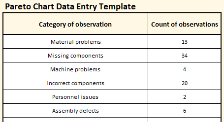 The items can be entered in any order. The important thing to notice is that the left column indicates the category of the delay, and the right column indicates how many times a delay of that type occurred during the observation period (one week, in this case). After entering the data, they create a Pareto chart by clicking the Pareto Chart button on the SuperEasyStats ribbon again. The chart is shown below:
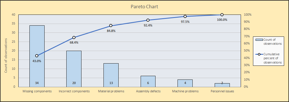
The bars in the chart represent the number of observations of each type and are plotted against the vertical axis on the left side of the chart. The line shows the cumulative percentage of all observations. So the 34 observations of “missing components” (the left-most bar) also represents 43% of all delays. And the combination of the first three bars:”missing components”, “incorrect components”, and “material problems” together represent over 84% of the delays.
While this chart is relatively simple to read, if there are many more categories, Pareto charts can become crowded. Sometimes it’s helpful to show just the main items. If you want to show just the top three items on this chart, you can change the number of categories you want to display by clicking the Pareto Chart button on the SuperEasyStats ribbon again. You will see the following dialog:
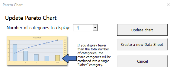
To see just the top three items, with all other items grouped together into a fourth column, choose “4” as the number of categories to display. Then click “Update chart” and your Pareto chart will update as shown below:
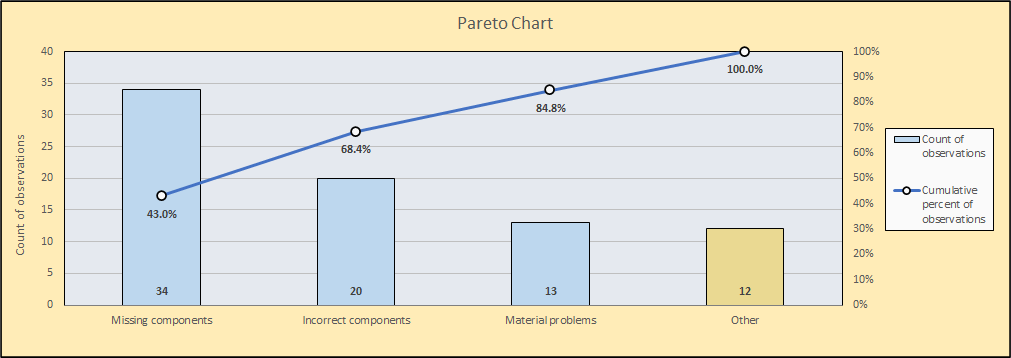
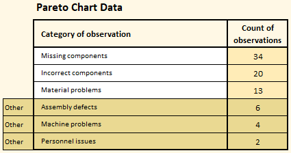
You will also see that the data table to the left of the chart has updated, indicating which categories are included in the “Other” bar on the chart:
In this situation, the team working to reduce delays would probably choose to focus on these top three items, or possibly just the number one cause of delays, “missing components”. In fact, they could go a layer deeper break down the 34 missing components by type to show which components they should focus on first (as shown below). Pareto charts are simple to create but invaluable for seeing and prioritizing improvement opportunities!
